
During the business hours, Mathews was in a hurry to get hold of a content about something that was for his professional skill. He was too relentless to get that content (See the level of persuasion is too high!!!). Exactly at the time, he was opening the blog, he sees a 404 error page. Just imagine the frustration!!! But hey, that 404 error page conveys a message that Mathews cannot stop smiling just by looking at it. This humor in Web Design displays an image of an astronaut cartoon stuck in a meteor, with this image, the text says, “Looks Like You Got Lost In Space”.
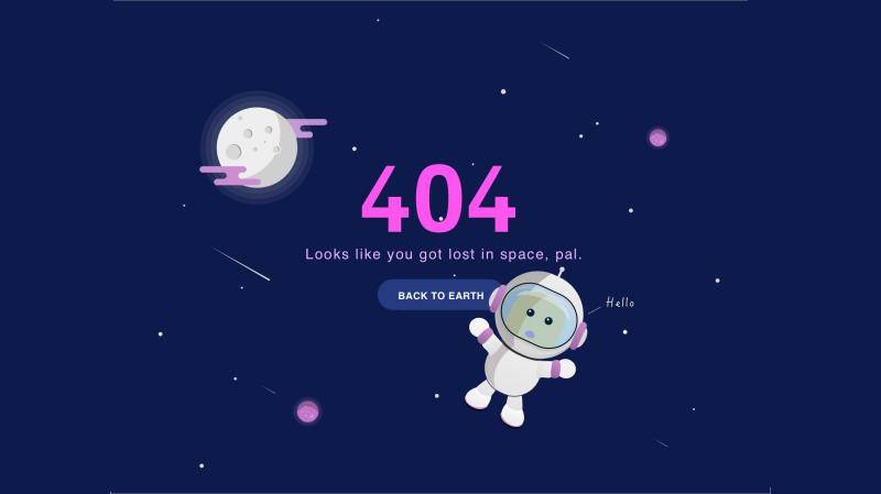
See, that is the power of humor, which persuade Mathews to stick with that website for some more time. This gives them low bounce rate and a happy visitor (JACKPOT!!!). What else you want from your website?
Humor is always a very important facet of life. Imagine you never laugh, how grim that will make you!!! A smiling face is the most beautiful face. And humor initiates smile, even crack of laughter which helps you in reducing your stress, increase your psychological well being and also enhance the tolerance of uncomfortable things. You can tackle most of your life troubles with a smile on your face.
Why not we use humor in web design then? Well, that is exactly what you will get to know in this post. Just remember one important thing, using humor is not overusing it in inappropriate situations. I will get back to you on this, but first, take a peek at these points.
The Relevance Of Humor In A Web Design
There are many professionals who think humor has no relevance in web design. A web design is a serious business and no humor should use to annoy any visitor. Well, those who think like that, are not right in any sense. Yes, I agree that a web design is a serious business but there is a thin line that differentiates a successful web design from an unsuccessful one. That line is known as “User Engagement”.
It is very important for a web designer to understand the major trend that is going in the market. There are numerous cases where people just love the humorous stuff. The viral memes and videos are mostly humorous in nature. So, people do love humorous designs but yes, up to some extent.
Point to be noted here, you don’t have to be comedy-focused. Remember, humor can be differentiated with comedy. Comedy is just a part of the humor. With just comedy, it is very difficult to add meaning to the design. This is why humor is important as you can easily add up value to your content with some humorous icon relative to the design.
Let’s move ahead and see how you can add humor to your web design to connect with your audience.
Seeking To Add Humor To Your Website? A Checklist To Make Sure You Get That Right.
Humor is a pondering subject, it is interesting, it is deep and it is beneficial. When you communicate with a person, you comfort him by making him smile. Some humorous context of a topic makes them comfortable. However, there is an approach to it. In this section, let’s discuss some of it,
Know Your Target Audience First
It is a rudimentary step. Whenever you plan to give your user a mind-boggling experience, you must know them. What they like, how they respond, Do they respond, their tastes and etc.
See, the problem with humor is it can be hilarious at one point to one person, but it might hurt the other person. So, before trying a humorous approach, you must try to understand the liking and disliking of your target audience. When you don’t understand your audience and apply a web design directly, it may stray your User experience quality.
Timing Is Very Crucial In Humorous Web Design
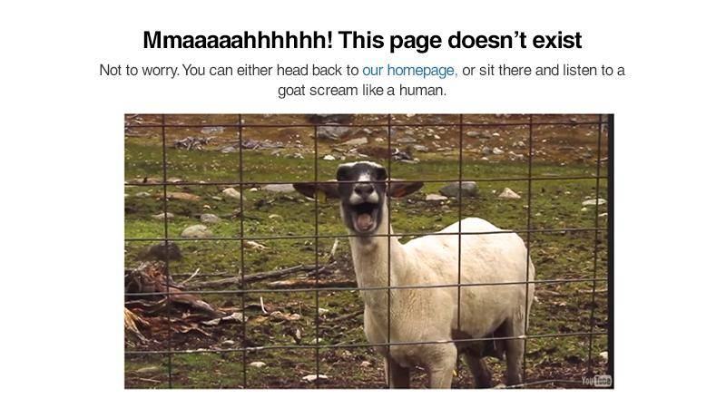
As I said earlier, there is a limit to the usage of humor in web design. You don’t want to mock your visitor and show yourself as you are deliberately wasting their time. This way, you will push all your users away from your business. Take an example, for instance, suppose your user is almost done with a payment on your website. All of a sudden, your server got an issue and your website showed the 404 error page. And here you have that funny goat image showing a text as “MMAAAAAHHHHHHH”. Imagine, how annoying that can be.
On the other hand, one user is normally surfing and you have a funny pop-up with an exit-intent technology. The user stops to read your funny message and before exiting your website gave you his email id and exit with a smile on his/her face.
Did you notice the difference? I do!!! Yes, there is a timing issue in both of the situations. You need to plan your approach and then anticipate the user’s behavior correctly to nail the purpose of the humorous web design. This approach can make your brand memorable for a long time.
Make Sure That You Convey Message With Humor
What will a humor do alone? Nothing, makes your visitor smile and then snatch it back right from them. This is not good right? Humor without the necessary information is an empty bottle for a thirsty man. No matter what joke the bottle’s cover says, it will never be of any use unless it is filled with water. The Same concept is with your website design.
You must convey the necessary information alongside with the humor. Don’t miss any of the element here. An information depends upon the way it is presented. Make sure you get the right way of presenting it and rest assured.
The Ultimate 404 Error Trick
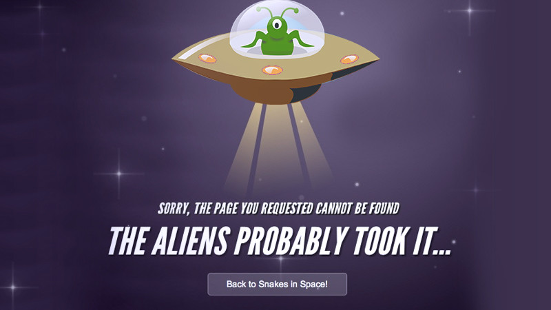
While surfing the internet, the most annoying part of the website can be its 404 error page. Yes, it is right. People often get hasty and close the web page. I agree that it significantly reduces the level of annoyance generated by the infinite loading error but still, visitor’s problem is not solved with an error page. So, it is safe to say that this page still annoying.
You can decrease the level of anger by simply and smartly putting a humorous text and image on the error page. The results will astonish you. The level of stress get counterbalanced and things get normal between you and your visitor.
Concluding Remarks
In this end, my simple formula for effective humor in web design is making is relevant and funny enough or something more unique to make the visitor realize that how hard you work for them to keep them sorted.
This is the way which will effectively increase your user interaction and keep your bounce rate low.
Did I miss something? Let me know via comments and I will get back to you. I do hope you like my post. Please share it to spread the word. Have a great and humorous day ahead.
Let Us Help You Create a Spectacular 404 Error PageSee our web design packages |