 Mar 20, 2026
 It is the easiest to build a store in Shopify, but what about making it profitable? It is in the beg[...]
Any project, whether it’s a website or a logo design, requires the designer to put in their best efforts and imagination. Also, the client’s needs or business goals make the designers bring everything into effect by using their imagination to some extent.
When it comes to logo design, it reflects every company or organization. In simple terms, it demonstrates what the company is all about and how it can assist the target audience in meeting their goals. Innovative logo design aims to convey the brand’s vision and mission to the visitors.
However, many logos are designed to a certain point of context that either justifies the design or brand’s name. Hence, choosing the right and creative font for logo designing is vital. This is important because it increases the brand’s visual appeal and relevance. Furthermore, relying upon the wrong font can transform the brand perception among the target customers.
Given the fact that several fonts are available to choose from, picking the right one could be challenging.
![]()
If you don’t know, typography is an important design tool that allows different fonts to interact with distinct attributes. It represents and reflects the business personality. As a result, knowing all of the fonts and their characteristics is important for creating a visually appealing logo.
To name a few, below are different fonts with varying traits:
Serif: Also known to be classic, Serif is a refined and traditional font.
Sans-Serif: These fonts have a simple, geometric, and modern appearance.
Display: Such fonts are useful for designing effects like novelty, unusual, and funky content.
Script: Script fonts can be used for elegance, feminism, and refined looks.
Slab-Serif: Designing rustic, vintage, and ambient logo is possible with Slab-Serif font.
Selecting the perfect font for your business logo, let alone integrating two fonts in one, is a difficult task. This is because if two fonts are strong enough, they will overlap, making the logo appear cluttered and unorganized. Hence, one way is to combine two fonts that complement each other. As a result, merging two fonts that support each other is one choice.
However, combining two fonts requires time, patience, understanding, and practice. Also, to avoid the procedure of trying and failing, the following are some relevant considerations to remember:
Find Shared Traits: It’s the shared characteristics of two fonts that make the two a good match. The personalities may include the width of content, height, or the looks of fonts. Furthermore, the two fonts could be from the same family. The most important thing is to figure out how to bring the two fonts together to make them function hassle-free.
Avoid Comparable Fonts: It’s possible that the two fonts have identical functionalities and personalities, and combining the two could be pointless.
Select Fonts With Varying Personalities: This is because opposites attract, and choosing the two different fonts could help in the creation of a lucrative and relevant website logo.
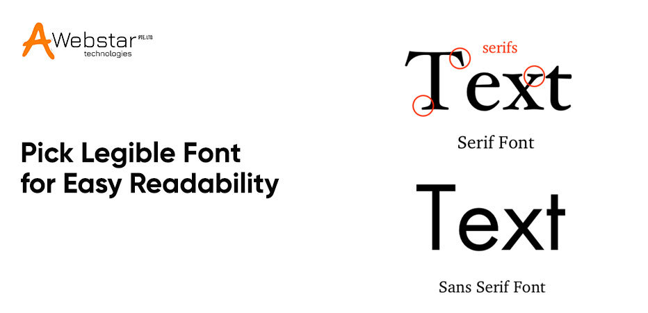
Font Readability! Rings something? Yes, readability is an important consideration for designers when designing a sensible logo. However, several businesses underrate readability to stand ahead of the competitors and design a logo out of the blue.
Thus, picking a distinctive font is essential to stay ahead of the competitors. However, it is also crucial to identify if the font is easily readable in any size, characters are legible, or the font would require too much space.
It is often advantageous to use innovative fonts, but if consumers have difficulty reading the content, it won’t convey the message to the audience effectively.
Since your logo will be enlarged on a large screen and shrunk equally on a small screen, font size is essential. This means that when it comes to the smallest or largest font size, the logo font you choose should prioritize readability. Additionally, smart mobile devices are increasingly being used to access services rather than desktops or laptops. As a result, using certain online resources to measure the readability of the logo font may be beneficial.
Although designers have the right to express their imagination, when it comes to a specific niche, remaining true to the project needs is also a responsibility. The logo style and font must match the business identity you will be targeting. To do so, both designers and brand managers must first determine the brand’s intent and target audience.
For example, does the company focuses on adult preferences or serve the children’s community? Furthermore, each of these audiences requires varying fonts.
A retro fashion brand for middle-aged ladies will not be able to use the font used for a beer brand aimed at young men. Hence, the font you pick should be able to convey your brand message. When your customers see your brand logo, they must feel important. In simple terms, logo fonts must be able to connect with the customer’s needs. Altogether, designers need to agree on brand goals to make an informed logo font decision.
Several logos are different depending on the type. Some logos are strictly dependent on typography, while others are purely graphical images, illustrations, or a combination of both. Hence, if you are looking to design a logo with graphical elements, you need to identify how to match fonts with those graphics.
The keen interaction among the fonts and additional graphics is essential and line weight is the key to ensure the right and lucrative font of your company logo. The relationship between fonts and additional graphics is critical, and line weight is the key to ensuring that your company logo’s font is the correct and profitable font.
The relationship between fonts and additional graphics is critical, and line weight is the key to ensuring that your company logo’s font is the correct and profitable font. If your logo has a swirly and feminine feel to it, pairing it with the right font will help it stand out. Moreover, if the logo is highly detailed, it can work better with a serif font.
When designing a logo, kerning is extremely important. Do you know about kerning? It is a method of adjusting the spacing between identical font characters. This way representing the visually appealing text becomes easy with legible readability.
Script fonts are ineffective as they disrupt the letter appearance, resulting in a poorly designed logo. Thus, increased whitespaces among these could lead to unpleasant and undesired logo effects. As a result, a small logo with fonts that look good on the web should be used. Ensure the logos are not only attractive but also scalable. Since there are a variety of display sizes, logos must be built to fit both small and large displays.
Another factor to remember while logo designing is to determine how the logo displays in varying color spaces. The specific typefaces can cause losing readability when seen in grayscale or white. To create a readable and attractive company logo, keep versatility in mind at all stages of the design process.
Additionally, the fonts downloaded from the internet must be credibly licensed. As some fonts are available free only for personal use and require proper licensure for professional and commercial use.
Also, budget and pricing can’t be overlooked while selecting fonts. Now, how much can you invest in fonts?
If you have a limited budget, you can save money by selecting a few typefaces and looking for comparable choices. On the other hand, if you use a variety of typefaces, consulting an online library will be a good idea. These have credible licenses and are cost-effective, but the disadvantage is that they cannot be bundled for a customer.
The fact that fonts are available does not imply that you can use them in whatever way you want. Knowing how to use fonts effectively is crucial, and the most important tactic is to build high contrast. Consider the contrast between the design canvas and font range when selecting fonts. Each element investing in logo designing plays a vital role in creating contrast for easy font readability and conveying the right brand message. Hence, determining the options can assist you in determining whether the contrast is appropriate to meet the logo design requirements.
The best part about exploring how to pick creative fonts for logo designing is you get to represent your creativity. Combining fonts, graphics, and other components is a fun adventure that helps to bring many projects to life. Consider all these crucial factors to achieve brand recognition and business expansion. Fonts depict brand identity, so make the choice wisely. Remember to consider font aesthetics too to match the consumer vibes and brand values. Potential consumers should be enticed to explore more about the brand font. However, it is always suggested to seek professional assistance from a logo design company that has a manner of picking the right colors, fonts, and the sense of log creation.
At Awebstar Technologies, we provide responsive web designing services eliminating bad design choices and creating realistic business site designs. Our team of experts creates multi-platform website designs that are compatible with a variety of browsers and have easily readable content.
What are your thoughts? Please let us know how we can assist you in fulfilling your web design needs in the comments section below. Thanks for reading!!
Mar 20, 2026Mar 11, 2026Sep 2, 2025We'd love to hear from you! Send us a message or Call us, and we'll be happy to set up a time to understand your needs better.