 Mar 20, 2026
 It is the easiest to build a store in Shopify, but what about making it profitable? It is in the beg[...]
Everyone reacts to visuals and good website design pleases the visitors!
Accept the fact that if your website is unable to excel then, you are losing your potential customers.
The online presence can make or break your business. Merely in some seconds, the visitors make an opinion about the website.
What does your company deal with? Is navigating from one page to another seamless? What about the website bounce rate? How about the website speed?
The above are some questions that the visitors take into consideration. The website is ideal when it gives exceptional functionality, website user experience, and complements the content.
If the answer to these questions is “No”, then, it is challenging for you to consider web design and optimization. The statistics say that:
From above, it is evident that creating a web design that appeals to visitors is a must. Considering that, here in this article, we are presenting to you the 11 tactics to improve the website design in 2023 and assure positive results.
Make a plan of how you will improve or create an outstanding website design. Roughly knowing the requirements or ideas behind designing makes the completion of the overall process an easy task.
Begin by knowing the customer journey when they first visit the website and become a potential customer. While planning, contemplate which pages they view the most, which content they will like, or which services they will like to take from you. Finding this will support you in designing the website and nurture the leads from the sales funnel.
There are many Customer Relationship Management Solutions that can help you map the customer journey. It lets you know about the visitor’s practices when they visit the website. Also, you can know about the common points between the customers who do not and are visiting the website.
From all the mentioned touchpoints, you can understand the pain points, emotions, goals, opportunities, and thoughts every touchpoint requires to evoke.
While shopping on the online stores, we entitle the interest on the product with four or five stars or have a good rating. Of course, it defines the experiences of the existing customers.
Our trust goes to the products that do what promises or what we need to perform. Hence, we purchased the product. In the same way, the website, its service, or its product works. When the visitors notice the impressive testimonials from the customers, there are 58% chances that they will buy from you.
However, the question here is; how the testimonials should look visually to gain customer’s interest or trust. Well, some strategies are there that you can adopt. The first is, which testimonial format do you require, video or text? If you ask us, then, video testimonials have shown tremendous results. The reason is simple-it gains visitor’s attention quickly and for longer. However, it creates a strong connection between seeing the faces of real people and hearing voices.
Definitely, there are text testimonials as well. It when incorporated and designed properly will build trust with the visitors.
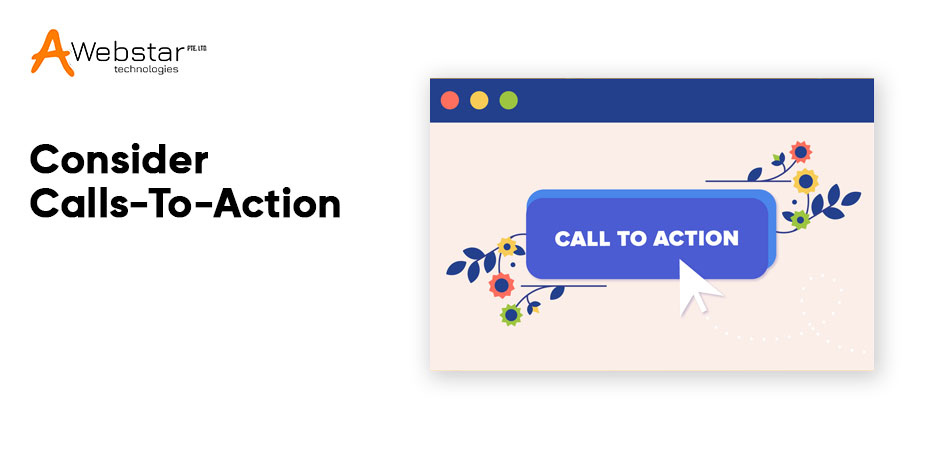
When the visitor visits the website from the home page or blog, they need to navigate from one page to another easily. And for that, they need guidance to the places on the website that let them nurture the conversions. Make it easy for the visitors and let them move in the right direction. They do not need to struggle to find out what they are searching for.
The right way to promote the web design is to leverage the strategically placed CTA in the fields, like, the bottom of your website pages, below sections that need action, and the top right of the navigation.
However, do not forget about the customer’s journey. The simple thing here to practice on the website is to overwhelm visitors with the bottom-of-the-funnel (BOFU) CTA wherever they navigate. Although, if someone does not want to buy, then, of course, they are not going to take any action.
Navigation is important when designing the website. Essentially, it is the map that shows the core web pages that the visitors must visit. This is the way that visitors can find out the areas, like, blogs, products, services, and many more.
It is totally worse if the website has a confusing or disorganized navigation interface. Confusing or vague hypertext, overstuffing of navigation, organization, or lack make it complicated for the visitors to know where they would like to go.
When the user is unable to find what they are searching for, they do not prefer to stay on the website. Rather, they will bounce and move to the website which provides a better user experience.
For boosting the process of website navigation, it is essential to assure that the visitors can find out what they are searching for. It includes responsive design, navigation hierarchy, and streamlined content so that the experience should not change on mobile.
Long before, everyone felt cautious about adding or editing the website pages, particularly the homepage. It is the users’ fear of not scrolling, therefore, it overpowers them to try and cram what they can in the most popular screen size visitors view their website with.
Although, that days do not exist now. 74% of the viewing time on the web pages in the first two screenfuls, about 2160px horizontally is preferable Therefore, there is no such need to be anxious about making a powerful homepage and create a better user experience.
It is better to add three to five sections that assist current and recurring visitors to the major areas of the website. What are these sections? The list could be as lengthy as you want it to be, just a sharp hit-list of some of the important element comprises:
Basically, the header tags are the titles on the page. However, in HTML, we have access to the six header tags. Assuredly, use the header tags to assist the search engine to know what the web page is all about.
It is the main title for a blog post or website page. In the blogs, the H1 tags could be – How to improve the Website Design. You should know that the H1 tag uses only once on the page
It is the subtitle, consider it as another option to the main title. The H1 and H2 tags optimize for creating traffic from search engines. The H1 tag is the main description and H2 is the question.
As such, there is no requirement to leverage the header tags in the website content. The H1 and H2 are used whenever feasible. Every section of the blog contains a subtitle. Every subtitle has H3 and H4 tags.
It is the best method to include keyword phrases in the header tags for best search engine optimization when probable.
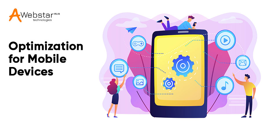
Assuring the website is mobile device optimized and is very important. It is true not only from the user perspective, however, from the Search Engine Optimization (SEO) perspective. Apparently, most spent working days in front of a personal computer or desktop. However, when we are away, then, a mobile with reliable internet connection is preferable.
The visitors are used to viewing the mobile-friendly website. Specifically, this is termed as Responsive website design. You can carry out an easy check on your website design is SEO-Friendly Design or not.
Carry out the mobile-friendly test on the website and find if you have the good green text “Page is mobile-friendly”. If it is not, then approach the website designer and let them fix the issues soon.
While creating a responsive website, you must recognize how the content is seen on various devices. In several cases, the content to be shown on the mobile device must stack in a similar order as the desktop version. It will assist to recognize the upload time and assure a seamless user experience among various browsing devices.
Each image on the website page must have an ALT tag. Consider Alt tag as the briefly written detail of an image. The Alt tags fulfill two separate objectives. The first one is that an image alt tag optimizes the search engine pages. If you need to guess the image, you can relate it with online shopping. You can see the shopping trolley, shopping bags, and the mobile devices with products and their description.
Nevertheless, the search engines notice none of the visual detail, well not these days, the concept of Artificial Intelligence might change it. If we include the Alt tag in the images, then, the search engine can understand what the image is all about, that’s it!
Although choosing the accurate Alt tag is vital. So, it is essential to think about what the new customers are about to type in the search engines. It also fulfills the second essential purpose, the image Alt tags are used by the screen reading software for those who are visually impaired. Create websites that are accessible by all and let you rank better in the search engines.
Only including the website pages by keywords and rank higher in the search engines is not enough now. Search engines such as Google are advanced and could perceive the underhand SEO methods. Anyway, you are not just creating a website for search engines, you are creating websites for actual visitors.
Before thinking about SEO, open the text editor and write the content of the services or products naturally. Accordingly, this makes the content not look spammy.
When it is completed, the suitable keywords phrases are searched and included in the content. The page titles, alt pages, header tags, are used as an additional benefit.
When you are providing services, then, it is beneficial to make a portfolio to show the work. From the website portfolio, you can assure your potential customers that you can provide quality services.
Do not forget to include images, text, or additional video content for every example in the portfolio. You can even make categories that enable the website visitors to refine the portfolio work.
Making the portfolio is complicated when you are new to the business, besides, why not just add a few examples of what you can accomplish. Assure you are keeping the portfolio updated, and add the projects while completion.
Also, you can build the case study section on the website when the services are result-oriented. The case studies work excellent when you categorize how to get good ROI for every service you have offered to the customers.
When you are selling the physical products, then, build a video gallery with product description (As demonstration). The video can be uploaded to YouTube and include the videos on the website. Make a different page for every product and include the video testimonials for more product credibility.
The website must be a living, interesting and engaging element of the company, not static. There is always improvement. Enhancing specific areas of the website improves pages per session, time on pages, boosting conversions, however, finding what solutions work properly in enhancing the website is the toughest part.
It is where the A/B testing arrives. Considering two variations of the pages and testing them upon each other reveals when specific areas are building issues for the users. In many cases, the web pages might be performing properly, however, have outdated details. A/B testing the web pages could reveal how well the page’s content has on the session duration or conversations possibly.
In many cases, you might like to notice that design updates can influence page performance. Easy changes like refining copy, headers, or button colors can make changes in the conversion rates. With that said, in addition to the “Set it and forget it” approach, particularly if you do not like to change, you can leverage tools to carry out multivariate tests, A/B tests, and setting up heat maps, etc. to know what visitors are doing.
Every test shows different types that find out why the visitors are communicating with the web pages in distinct ways. From here, the tools and tests will be monitored, on a weekly or bi-weekly basis to find out how the changes made are influencing the web page performance. Reviewing usually also enables you to adapt sooner if things are moving in the wrong direction.
Giving time to the web design can bring in many positive changes to the website. It helps in improving the customer conversion rate, experience, and performance. So, follow the magic tricks we have mentioned in the article. Definite results are at your door!
If you are uncertain of the changes or do need assistance for web designing, then, approach. The professionals here at Awebstar will help you out with your queries or if you will demand to design the website, then, we will do that as well!
Thanks for reading!
Mar 20, 2026Mar 11, 2026Sep 2, 2025We'd love to hear from you! Send us a message or Call us, and we'll be happy to set up a time to understand your needs better.