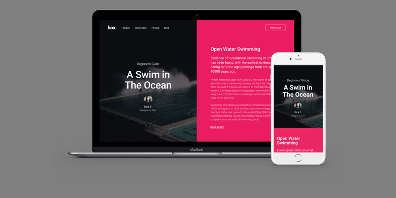
Split screen homepage layout concept is never a new one. It was first introduced back in the year 2012, where many web designers keep experimenting with some new design possibilities. Then by the year 2016, it became immensely popular among the corporate world.
Enterprises like Apple and other start using split screen homepage layout. They truly showed the real potential of this layout. So, it is not a new concept, still, web designing always have a whole new level of possibilities.
What’s the catch here:
Well, in this post, I will give you all the detailed information about a split screen homepage which will help you to understand and innovate the split screen layout. This way you can cater your viewer the best UX experience. In addition to that, you can also make use of storyboarding in UX Design. The amalgamation of these two factors will definitely bolster the engagement of your website.
So, let’s get you started with it.
Why Use A Split-Screen Homepage?
There is a segment of web designer who believes that split screen component is best for minimalist web design. It can really help you to combine the negative space and generate a supreme amount of focus on the areas of real interest.
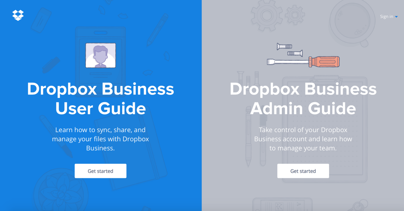
They are also proving to be immensely beneficial for landing pages which can help you to cater two CTAs at the same time with the equal weight of importance.
3 Elements To Keep In Mind While Thinking About Design Split Screen Layout
There are 3 components which you don’t want to lag on while you are strategizing for split screen pages. Here are the three important elements to keep in mind,
Mobile Responsiveness

This is a very major factor to keep your priority on. With Google and other search engines emphasizing on mobile responsiveness, it is now mandatory to keep your website mobile responsive.
However, split screen layout is quite difficult to scale. This is one of the trickiest design tasks that you can ever get your hands on. So, keep your eyes on the mobile responsiveness of your homepage when you are using a split screen layout.
Without A Good Reason, Never Split Your Homepage
I know what you are thinking. It is trending and looks really nice, then why not use it on your website. A big no for that. If that is the only reason you have and you are looking to really transform your website into a split screen layout, then you need to reconsider your thoughts.
Focus on these pointers before you make the decision,
- Do you really need a website redesign?
- Are your customers are trend conscious and will they really appreciate the new looks of your website or will it confuse them?
- Are you sure that you have enough amount of negative space through which you can make the layout work?
- Are you better off with splitting the focus of your user or a singular focus is what you need?
Also Read: Signs That Indicates Your Website Need To Be Revamp
Explore New Ways To Display Content
Normally, a website work on a horizontal layout. But when you switch to split screen layout, you take your website to work on a vertical layout which can either give your website the main focus or an outcast.
You need to find out more possibility by which you can display your content in the negative space of your website. Stick to your creative cap and explore!
Also Read: Why Should You Start Your Web Designs With At Least A Little Content Planning?
When Split Screen Works Best For You?
Suppose you have two things to promote or multiple things to promote. You can effectively use the split screen layout for your website. Take an illustration into account.
When you have two entirely opposite variants to offers, you can use split screen layout to showcase both of the variants and let your visitor decide what they exactly want. A split screen gives your products or services equal importance without any problem.
Techniques To Use For Designing Split Screen Homepage
Now here in this section, we will discuss some of the important elements you need to follow if you wish to have a perfect split screen page.
Let’s get you started,
Combine Dramatic Typography And Vibrant Color

You must have heard about the material and flat design. This type of design gave trend to some of the new generation element of design. Typography in Web Design and Usage of vibrant Color makes a website visually stimulating and a dramatic typography makes your content readable.
When you work in a split screen layout, you need to work on both of the factors and make things easy for your visitor. You need to be explicit in the way you are using a typo and the colors. That is the reason I used Dramatic for typo and Vibrant for color.
Create A Focal Point For CTA Buttons

You can summarize the usage of split screen layout as a simple graphic trend that can really add value to your CTA buttons. The amount of negative space given by this layout can be utilized for designing attractive call to action buttons.
The vertical layout of the website will add value to the CTA buttons you put there. Also, you can add multiple CTA buttons with an equal value proposition. This will engage your viewer in a better way with better results.
Maintain A Visual Flow between The Screens

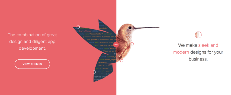
While designing a split screen homepage, make sure that you make the two screen visually connecting. You can use color as a base and then add effect to it with different content. You need to be sure that both maintain the visual flow of the homepage.
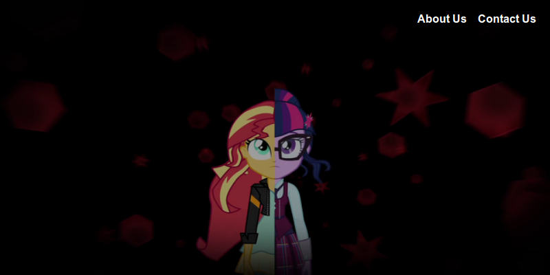
You can use a dark texture with a contrasting color to make your homepage more visually stunning and vibrant.
Encourage Your Users To Act By Using Animations

When you are using interactive animation, your viewer gets visually attracted towards scrolling and making clicks on your website. This is an enhanced user engagement example. A visitor staying on your website and interacting well with it.
Use animations and encourage your users to act and respond to your CTAs and contents.
Winding It Up
So, these are the major tenets of your split screen homepage design which can give your website’s homepage an extravagant edge from your competitors and increase the performance of your website.
Create a split-screen design for your business websiteChoose your Design and hire us to build a professional looking website today! |
I do hope that you like the post. Please do share it and spread the word.